Devlog 3: Designing levels and graphics

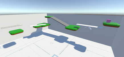
Hello everyone! Welcome to A Little Help From Above’s third devlog. In the previous devlogs, we presented the different mechanics we’d been working on. We decided to create some basic levels to introduce these mechanics and start having a playable prototype. The result is a series of short levels that we’re pretty happy with.
Level design
This part of development was pretty different from before, as it wasn’t focused on tech and implementing mechanics, but about designing fun levels. This meant we had to think about things such as how to introduce mechanics in an intuitive manner, make challenging but fun puzzles, have a progressing difficulty, etc. We still had to develop certain aspects because as we were designing puzzles, we found specific items or objects we needed to implement (such as a seesaw that reacts to objects being placed on either side).
Art style
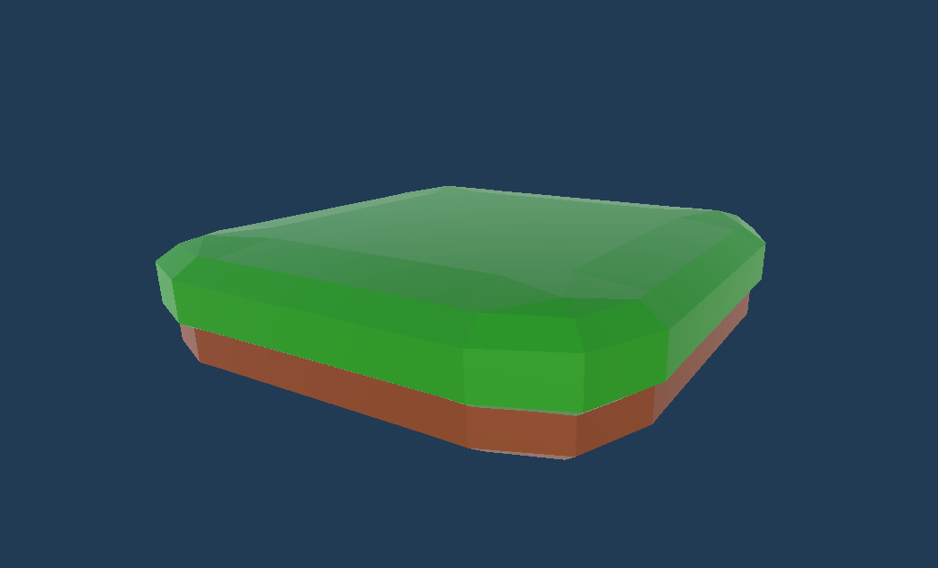
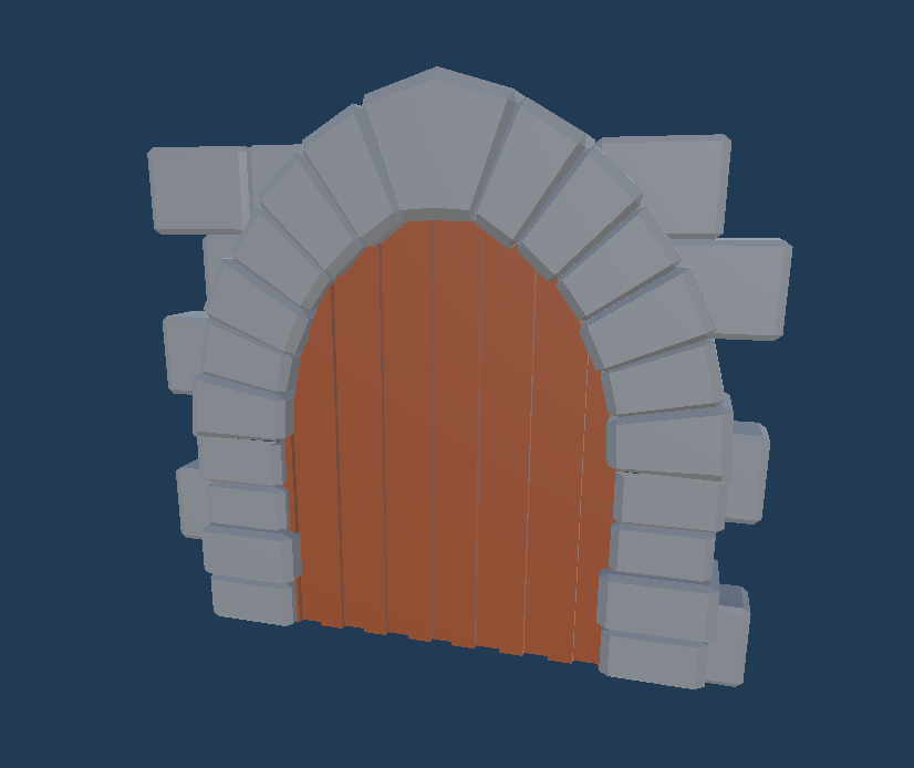
Up till now, the game was looking pretty bare bones visually. Everything was basically a stretched or deformed cube. We wanted to get a basic art style for the game to not look horrendous while testing. Since neither of us are trained artists, we decided to go for a simple low poly art style. I’ve been practicing my blender modeling skills and while things don’t look great, they’re still better looking than the basic untextured unity cubes. For now, levels are going to be made up of grass platforms and stone walls. Once we settle on a storyline/context for the world in which the characters are evolving, we’ll make assets that make sense within that context.
Here's a platform and a wooden door:
Levels
Here are some levels we’ve been working on:
Level 1: Introduction to the game
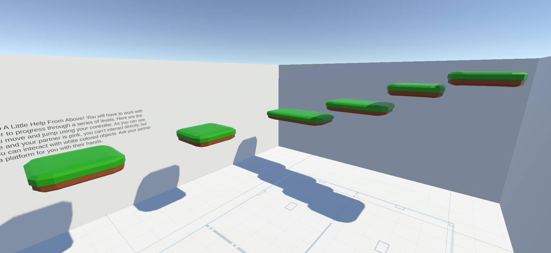
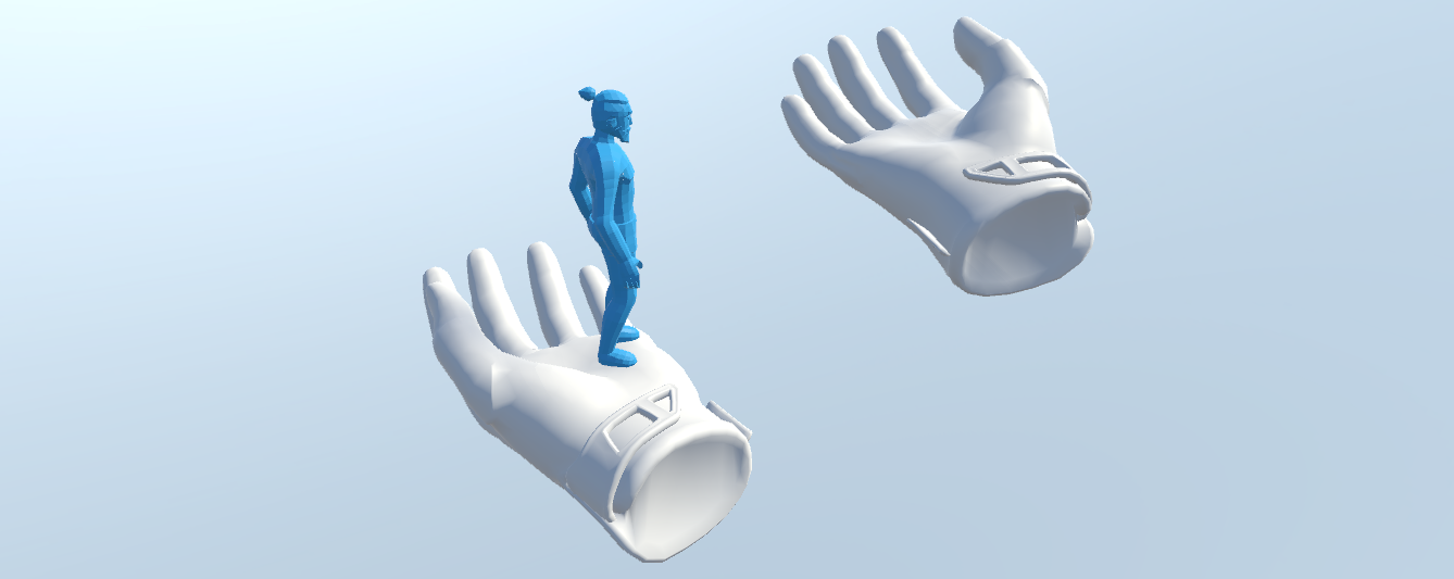
So the initial idea for the game was a small character needing to cross a gap, and a VR player placing their hand as a bridge to help the player across. As such, we thought it would be nice to have this be the introduction to the game. Plus it’s a pretty intuitive way to get players to work together. The level is very simple: a series of jumps only possible for PC with the help of VR.
Level 2: Introduction to grabbing objects
One of the basic mechanics is players grabbing objects of their respective colors, so we designed this level to teach players about grabbing and color interactions. The VR player must make a bridge by placing that long white plank across the gap (it’s too wide to be able to jump with two hands), and then VR must place a pink cube on the seesaw to change its orientation, allowing PC to get to the end of the level. Notice how once the pink cube is placed on the seesaw, PC has to traverse it to get across, showing them how colors work without telling them.
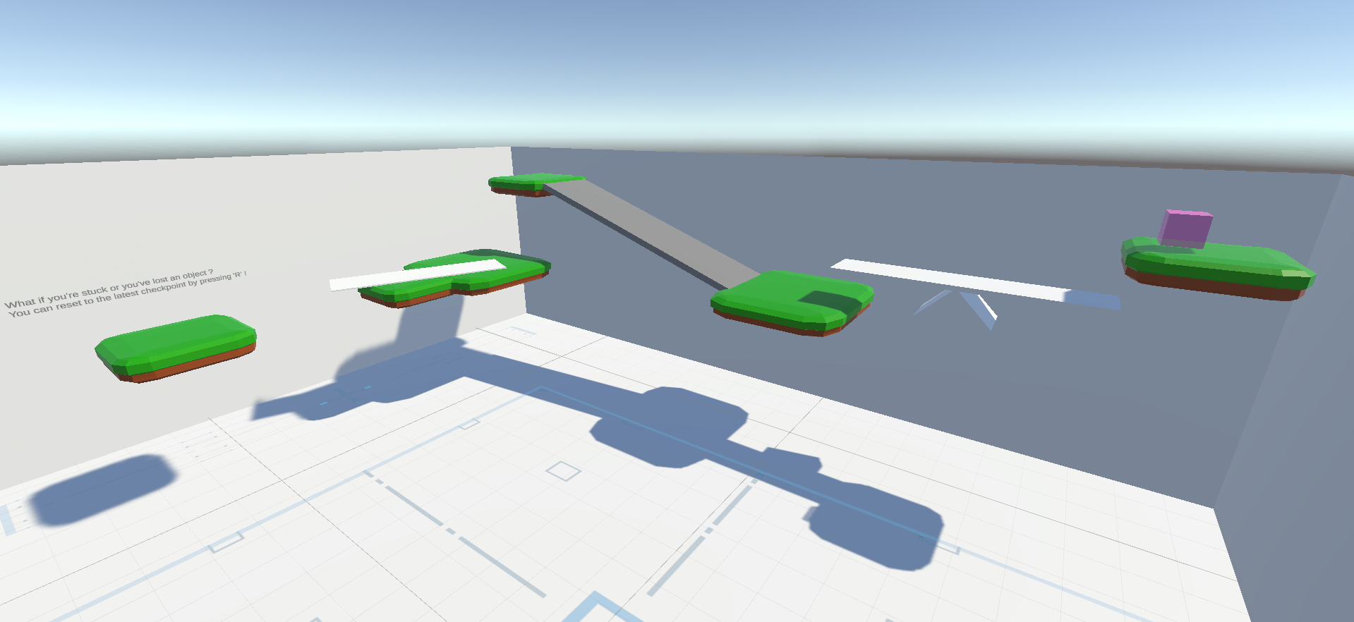
Level 3: Introduction to pressure plates and forbidden zones
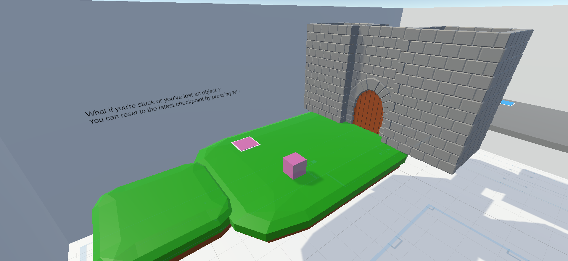
The pink pressure plate opens the door, VR simply has to place the cube on it.
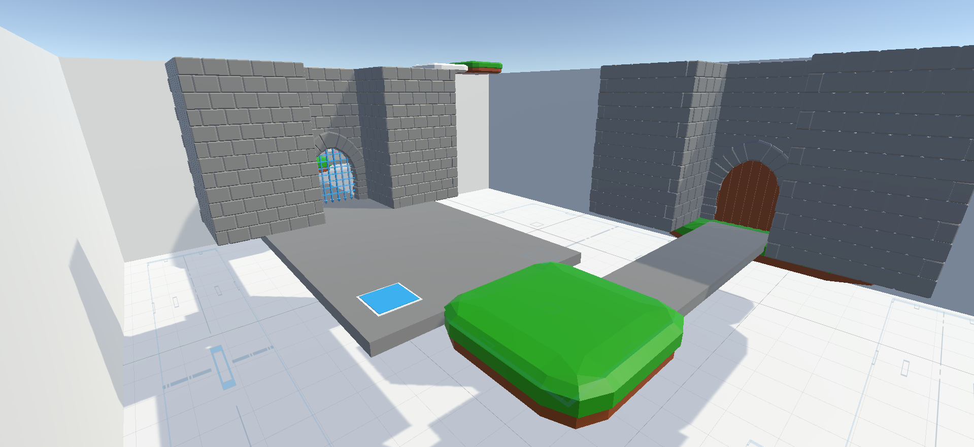
The blue pressure plate opens the blue gate. PC has to stand on the pressure plate to open the gate, then VR must lock one hand under the gate to keep it open for PC to pass.
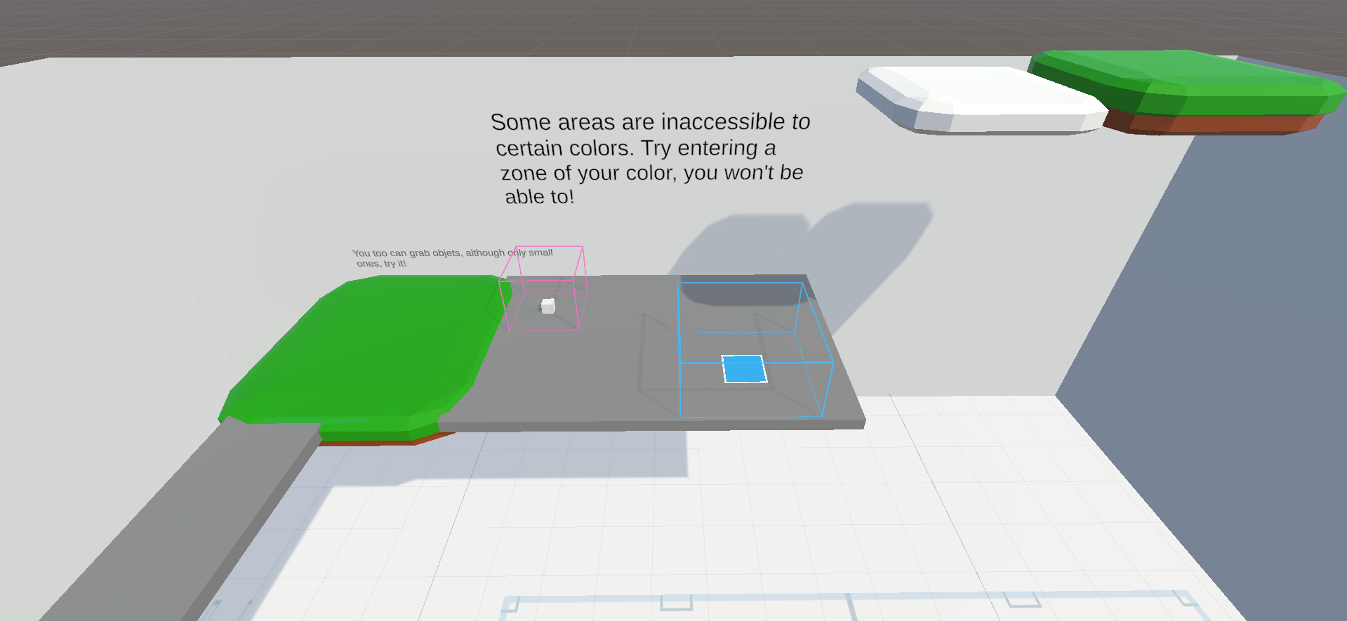
Try to figure this puzzle out yourself (the blue pressure plate lowers the white platform)
Thanks for reading and being interested in our game :)
~Waddles
Here's a sneak peek to another level we're working on!

A Little Help From Above
An asymetrical 3D platformer where a player in VR helps a PC player advance
| Status | Prototype |
| Authors | Pinkie Games, CodenameWaddles |
| Genre | Platformer |
| Tags | 3D Platformer, Colorful, Co-op, Cozy, Puzzle-Platformer, Unity, Virtual Reality (VR) |
| Languages | English |
More posts
- Devlog 4Feb 10, 2023
- Devlog 2: Interactions!Dec 06, 2022
- Devlog 1: First MechanicsNov 22, 2022
Leave a comment
Log in with itch.io to leave a comment.